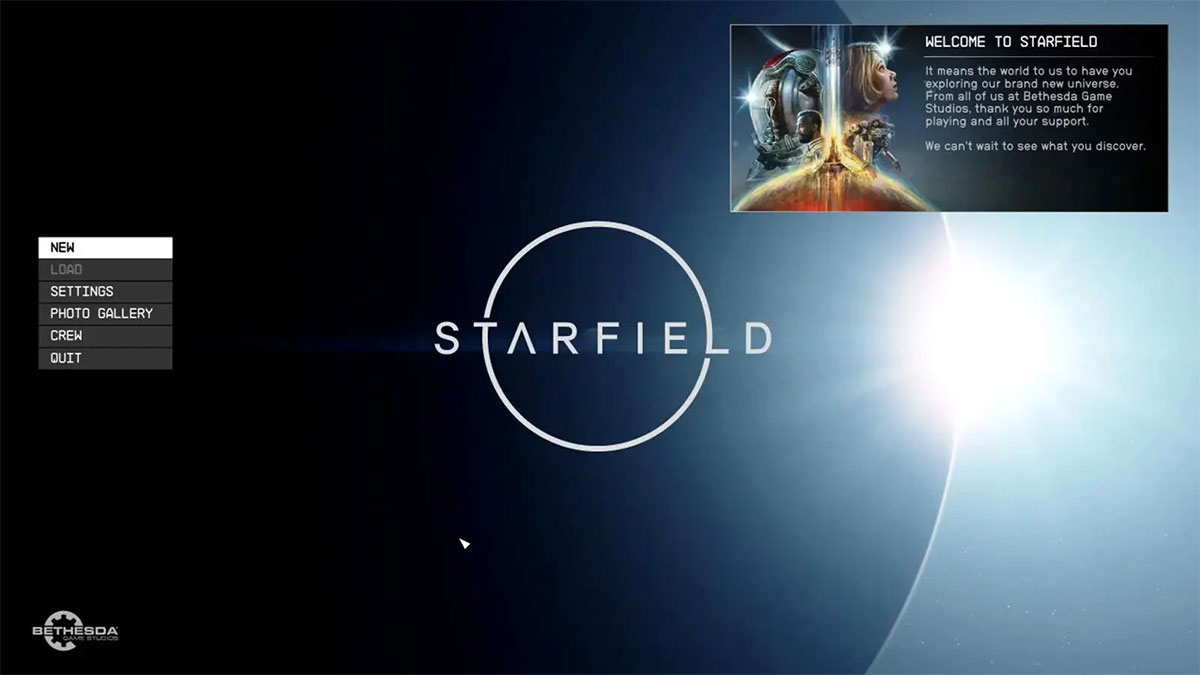
Did you hear the kerfuffle this past weekend? The Internet’s alive in debate over whether or not Starfield’s menu screen is up to scratch.
Sounds a little far fetched, but it did happen, and it all started when former Blizzard developer, Mark Kern, tweeted bizarre criticism of Starfield’s start screen, stating “the start screen of a game can reveal a lot about how rushed the team was and how much pride they took in their work.”
Fanning those flames, Kern claimed “Starfield’s start screen either shows hasty shipping deadlines by a passionate team overworked, or a team that didn’t care.”
The furore that followed compelled Pete Hines, Bethesda’s head of publishing, to jump to the defence of the team, insisting “they designed what they wanted and that’s been our menu for years and was one of the first things we settled on.”
“Having an opinion is one thing. Questioning out a developer’s “care” because you would have done it different is highly unprofessional coming from another “dev,”” added Hines.
We’re now at the stage where one of the year’s most anticipated games is right around the corner, and somehow or other, the main menu has become the primary point of contention.
An unexpected turn of events, yet one that does raise an important point; game menu screens in general are appalling, and we’ll give you a few reasons why.

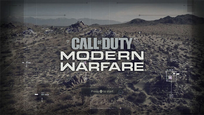
Firstly, it often takes far too long to get into the action. The simplicity of Starfield’s screen suggests that won’t be the case, but try loading Call of Duty and getting into a multiplayer game before you grow old. It’s easier said than done.
Painfully slow loading screens may have become a thing of the past thanks to SSD technology, yet that wait has simply been replaced by advertisements and unskippable cut scenes. Developers, please, just let us play.
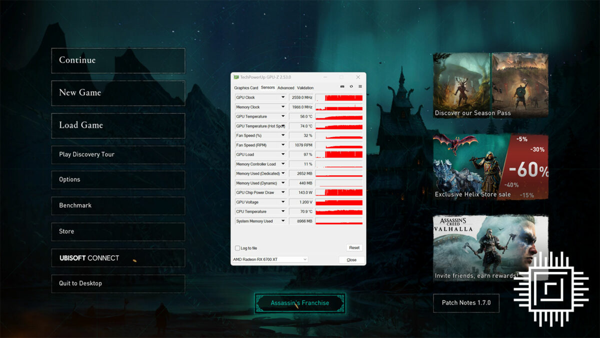
Secondly, and more importantly, there’s the important matter of power consumption. We’ve tested enough graphics cards in our time to know that menu screens can often be a major drain of electricity. There’s simply no need for it.

The severity of the issue is such that some games draw more power at the start screen than they do during actual gameplay, all for the sake of an animated background.
It’s safe to assume a fair few gamers leave titles on the menu screens while they grab a snack or are otherwise distracted, and this superfluous drain on resources really must stop.
Curious to see the scale of such inefficiency? Load up your favourite graphics monitoring utility and see what’s happening on a game start screen. You’ll be amazed how often your GPU is running flat out while waiting for someone to Press A.


